The Carbon Intensity Of Electricity
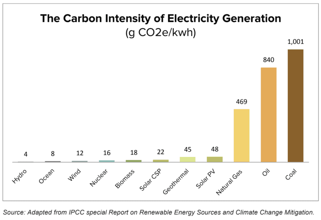
The carbon intensity of electricity varies greatly depending on fuel source. As a rough guide: coal has a carbon intensity of about 1,000g CO2/kWh, oil is 800g CO2/kWh, natural gas is around 500g CO2/kWh, while nuclear, hydro, wind and solar are all less than 50 g CO2/kWh. I’ve graphed them previously.
The carbon intensity of grid electricity is determined by the fuel mix used in generation. Using figures from the IEA I’ve produced a map to show just how different the carbon intensity of electricity is around the world.
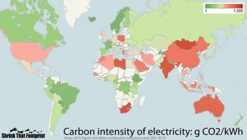
Countries colored dark green like Norway, Iceland and Paraguay have very low direct emissions. The carbon intensity of electricity generation in these countries is less than 20g CO2/kWh. The sources of these countries’ clean energy is due to the dominance of hydroelectricity, nuclear, and geothermal in Iceland. In contrast countries like India, Mongolia, and South Africa are dark red. They are on the other end of the spectrum. Electricity emissions are estimated to be more than 900g CO2/kWh. The most carbon intensive source is coal.
Most other countries use a mix of generation sources, so they are somewhere in between. In fact, we recently carried out an 2022 analysis of 85 countries in terms of their carbon intensity. We defined it as the amount of CO2 generated per unit energy. We found that in the last 10 years the world had come a long way by reducing reliance on coal. This pushed down carbon generation broadly.
Residential Electricity Use
The second component of electricity emissions is the amount of electricity used.
For this example we will use residential electricity demand, as we want to compare the emissions caused by household electricity use. Residential electricity demand accounts for roughly a third of total electricity demand and varies considerably from country to country.
We can show just how great these differences are using a treemap, where the size of each rectangle represents the residential electricity demand per capita.
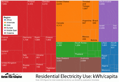
Norway has the biggest usage at almost 8,000 kWh per person. Americans, Finnish, Canadian and Swedish all use more than 4,000 kWh each. While places like Cameroon, India and Tanzania use as little as 100 kWh per person, so their rectangles are barely visible.
Electricity Emissions Around The World
Now that we have data for the carbon intensity of electricity and how much people use in their homes we can compare residential electricity emissions.
For this comparison we will also account for the emissions caused by grid losses using World Bank data but won’t include upstream emissions from things like fuel production, processing or equipment manufacturing.
The results are revealing.
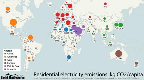
The largest footprints are from those countries that both use a lot of electricity and have quite carbon intensive electricity. Of the sixty or so countries we analysed Saudi Arabia, the United States and Australia had by far the largest emissions at more than 2,500 kg per person.
In stark contrast Iceland, Paraguay and Ethiopia each registered 0 kg, due to their incredibly low carbon power. Notably, Norway which uses almost double the residential electricity per capita as the US has emissions of just 152kg per person. In contrast India has more carbon intensive electricity than the US, but emits just 135kg per person due to such limited electricity use.
Population Matters: High Aggregate Carbon Intensity Translates To Low Individual Carbon Intensity In Big Countries
Computing carbon intensity on a per person basis factors in the notion of an individual’s impact. Two countries may emit the same amount of carbon. However if one country is much larger than the other, its carbon intensity on an individual basis is lower.
In the same vein, it is interesting that Chinese emissions are just 331 kg per person despite their high coal use. This highlights just how small the residential share of electricity use is in China. A quick look at IEA stats shows that Chinese residents use just 18% of generated electricity, in the US that figure is 38%.
The calculations used in this post can easily be used to approach your own electricity footprint.
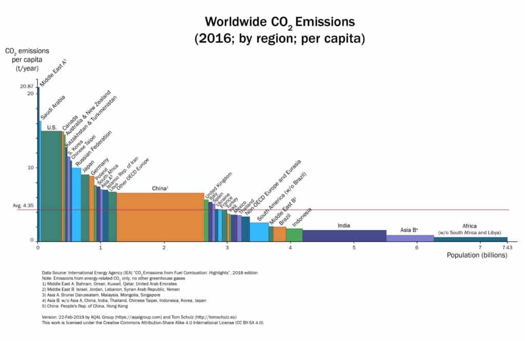
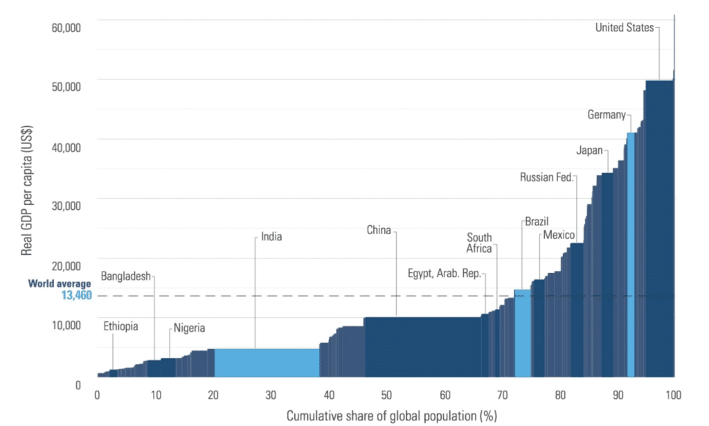
Incidentally the chart of carbon emissions and population size looks very similar to the shape of the GDP per capita and population size (below from World Bank). This is no accident, as GDP and carbon emissions are related, i.e. energy inputs is related to productivity. Note in this chart China has a very broad population base and much lower GDP per capita, whereas the “block” that defines the United States looks rotated 90 degrees by comparison with a much narrower population base and higher GDP per capita.

Anne Lauer
Anna Lauer is a writer, gardener, and homesteader living in rural Wisconsin. She has written for Mother Earth News, Grit, and Hobby Farms magazines. Anna is writing a new book about growing your food for free and an ultimate guide to producing food at little to no cost. When she’s not writing or gardening, Anna enjoys spending time with her husband and two young daughters.