The Big Question: What Diets Drive Carbon Emissions And By How Much
It is well understood that meat production has a big carbon footprint.
Numerous studies detail the climate impact of livestock, but just how big is it’s impact on a person’s foodprint?
By impact we mean the amount of carbon dioxide for a given diet after adding up all the contributions from raising the food source and transporting it.
This figure, over the course of a year, becomes more than a ton per individual.
This post compares the carbon footprints of five different American diets and finds that when it comes to foodprints vegans come out on top.
If you’re interested in a numerical breakdown of carbon footprint for different kinds of food, take a look at our new carbon footprint food database.
Meat Intensity Drives Big Variation In Carbon Emission
Even since the FAO announced that 18% of global emission result from livestock people have talked about the climate benefits of reducing meat consumption.
More recent studies show that food system emissions could account for as much as quarter of all human emissions.
That is 12% from agricultural production, another 9% from farming induced deforestation, and a further 3% from things like refrigeration and freight.
Such studies beg the question, what is the impact of meat on an individual’s foodprint?
This analysis tries to answer that question using data from the US. In it we compare five different diets:
We Created 5 categories: Meat Lover (aka carnivore diet), Average, No Beef, Vegetarian and Vegan
For each diet we look solely at the emissions associated with food supply, so we do not include those from consumer’s transportation, storage or the cooking of food.
Nor do we consider land use change emissions.
Rather than bore you with the methodology let’s start with the results and work back through how they were calculated, and 3 interesting findings.
1. Meat Lover Diet (aka Carnivore Diet) – Twice The Carbon Foodprint Of Vegetarian/Vegan Diet
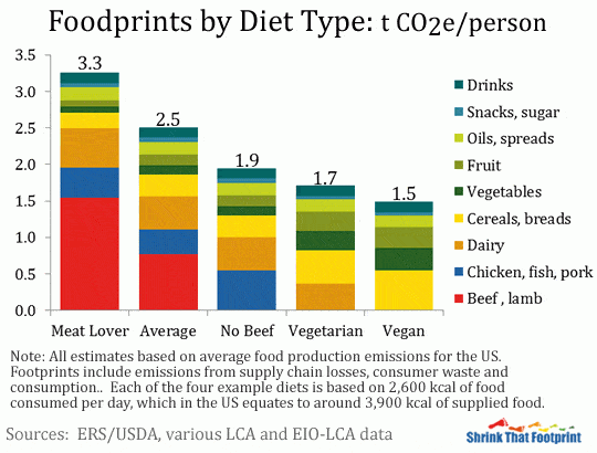
The results of our analysis look like the below.
A diet heavy in meat will have about twice the carbon foodprint as a vegetarian or vegan diet. Some people call a meat lover diet the “carnivore diet”.
If you’re interested in the numbers behind the meat analysis, you can check out our article on the carbon footprint of different meats.
In that article you will see that the carbon footprint of red meat like beef is ten times higher than poultry like chicken.

2. Average Diet – Foodprint Is 2.5 tons Of CO2 Emitted Per Year, Higher For Meat Eaters
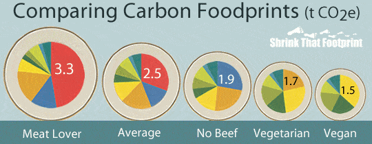
An Average American’s diet has a foodprint of around 2.5 t CO2e per person each year.
For a Meat Lover this rises to 3.3 t CO2e, for the No Beef diet it is 1.9 t t CO2e, for the Vegetarian it’s 1.7 t CO2e and for the Vegan it is 1.5 t CO2e.
Each of these estimates includes emissions from food that is eaten, wasted by consumers and lost in the supply chain.
3. No Beef Diet – Meat Gives 1/4 Of Food Energy Yet Half Of Carbon Emissions
In the No Beef diet all the reductions from the Average foodprint come by switching from beef to chicken.
Interestingly, we find that the average diet animal products make up 60% of emissions despite accounting for just a quarter of food energy.
The Meat Lover beef consumption causes almost half of emissions from just a tenth of food energy.
The difference between the Vegetarian and Vegan diets arises from dairy consumption being switched to a mix of cereals and vegetables.
4 and 5. Vegetarian Diet, Vegan Diet – Foodprint Is 2/3 Of The Average American Foodprint In Tons Of Carbon
A Vegetarian’s foodprint is about two thirds of the average American and almost half that of a meat lover.
For a Vegan it is even lower. But perhaps most interestingly, eating chicken instead of beef cuts a quarter of emissions in one simple step.
All Diets Share A Constant 60%, The Remainder Contributes To The Different Foodprints
Perhaps the most fascinating thing is that although the foodprints vary greatly, three fifths of each diet is identical.
In other words, 60% of food energy consumed is the same in each of these four diets.
The share that is constant accounts for 1550 kcal of food energy per day and about 0.7 t CO2e of each foodprint.
So all the variation depends on the remaining 1,000 kcal per day.
The Vegan gets these 1000 kcal for 0.8 t CO2e, the Vegetarian for 1 t, No Beef for 1.2 t, Average for 1.8 t and the Meat Lover for 2.6 t.
We Compared Energy Distributions Of 5 diet Variations Using USDA Data
Each of these five diets are variations of the average American diet based on data from the USDA’s Economic Research Service.
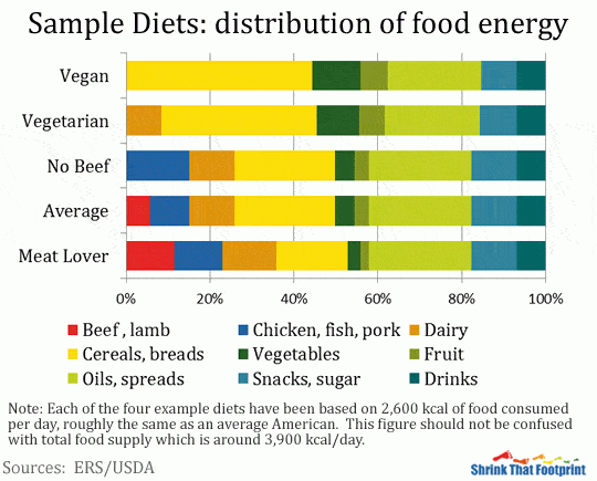
For each of our diets we assume consumption of around 2,600 kcal of food energy each day, roughly equal to an average American.
This should not be confused with total food supply which is around 3,900 kcal each day. In each diet food energy is split up among nine different food groups.
The five diets are all variations on the average diet.
We assume the Meat Lover eats more red meat, white meat and dairy in place of some cereals, fruit and vegetables.
The No Beef diet is just the average diet with all beef consumption switched to chicken.
The Vegetarian switches away from beef and chicken to fruit and vegetables, while also reducing oils and snacks.
The Vegan does much the same as the vegetarian while also eliminating dairy through further switching to cereals, fruits and vegetables.
In terms of food energy distribution the diets look like this:

The food energy that remains the same is each diet is roughly 450 kcal of cereals, 80 kcal of fruit, 50 kcal of vegetables, 580 kcal of oils, 220 kcal of snacks and 180 kcal of drinks.
The Inherent Emissions Of Each Food Group Contributes To The Big Differences
The reason that these five foodprints vary so much despite being so similar is that the carbon intensity of food consumption differs greatly between the food groups.
To estimate each foodprints we first calculated the carbon intensity of food consumption in each group.
This involved estimating the cradle to retail emissions of food production (kg CO2e/kg product), converting each to emissions per unit food energy produced, and then adjusting for food waste and supply chain losses.
This gives emissions per unit of food consumed (g CO2e/kcal). For a more complete explanation see our shrink your food footprint page.
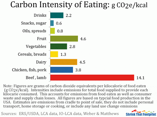
The carbon intensity of food consumption for each food group is as follows:

These figures estimate the emissions produced in the process of supplying a kilocalorie of food energy for each food group.
They show on average how carbon intensive it is for Americans to get their energy from the different food groups.
Order Of Carbon Intensiveness: Red Meat, Dairy, Fruit, Chicken
Unsurprisingly red meat is the most carbon intensive way to get food energy, followed by dairy, fruit and chicken.
Cereals, oils and snacks are the least carbon intensive. These factors are the reason why foodprints gets smaller as less red meat, dairy and chicken are consumed.
Although the carbon intensity of food production is the main driver in these figures, each is also influenced by how calorific foods are and what scale of supply chain losses and consumer waste they suffer.
Oils, Snacks, Cereals Have High Calories And Low Waste
For example oils, snacks and cereals are each highly calorific and have relatively low losses and waste, which results in them performing very well.
Fruits, Vegetables Have Less Calories For The Same Amount Of Waste
Counterintuitively, the opposite is true of fruits and vegetables which are less calorific per unit weight but have a very high share of consumer waste and supply chain losses.
Why A Vegetarian Leaves A Smaller Ecological Footprint Than An Omnivore
We’re often asked why a vegan or vegetarian has a smaller eco footprint than an omnivore.
The answer is found in the analysis above.
The carbon intensity of meat is higher than that of non-meat. The carbon intensity is higher because much food and energy goes into raising an animal.
It’s more efficient for you to get that energy directly, for example protein from nuts, than to get it indirectly from beef.
When the animal is very large, like a cow, the equivalent carbon cost is enormous.
Using food groups also hides great variation of carbon intensity within each group.
A hot housed tomato can have emissions 5 times higher than one grown in season, potatoes have tiny footprints compared to many other vegetables, and cheese has much higher emission than milk.
So by limiting ourselves to just nine food groups we greatly understate the potential that changing diet has to reduce food emissions.
Calculate My Foodprint
This analysis attempts to show the important role animal products, and red meat in particular, have in determining the scale of a person’s foodprint.
It’s relevance to your own foodprint will depend on what your own diet is like.
Because we use national averages for food consumption, production emissions, food energy content, food losses and food waste our estimates may vary significantly from an individuals diet.
Such caveats aside, this analysis does highlight that a small share of the food we eat can cause the majority of our food emissions.
Beef, lamb and cheese are among the most carbon intensive things we can eat, while milk, out of season fruit and other meats can also have relatively high emissions.
Shifting some of your diet away from these foods towards cereals or in-season fruit and vegetables is a very effective way to shrink your foodprint.
If you’re aiming for a very low carbon diet, you won’t do much better that a seasonal vegan diet, particularly if you also limit food waste.
For further reading food emissions check out:
Lindsay Wilson
I founded Shrink That Footprint in November 2012, after a long period of research. For many years I have calculated, studied and worked with carbon footprints, and Shrink That Footprint is that interest come to life.
I have an Economics degree from UCL, have previously worked as an energy efficiency analyst at BNEF and continue to work as a strategy consultant at Maneas. I have consulted to numerous clients in energy and finance, as well as the World Economic Forum.
When I’m not crunching carbon footprints you’ll often find me helping my two year old son tend to the tomatoes, salad and peppers growing in our upcycled greenhouse.

Can I use the image for my article on impact if food on climate change.
I think this is interesting and valuable information.
> “For example oils, snacks and cereals are each highly calorific and have relatively low losses and waste, which results in them performing very well.”
It should be noted that this is purely from a carbon footprint perspective and does not take into account nutritional value.
I respectfully question the assertion that fruit has a larger carbon footprint than chicken.
Maybe bananas or mangoes shipped to Alaska from Africa, okay, but runoff-irrigated fruit produced within 100 miles of its point of sale has got to have a smaller carbon footprint than chicken shipped the same distance, right? I have seen similar claims from students dissing almond agriculture because of its irrigation water needs. How are you calculating these footprints?