I really love the IPCC (high confidence), but if you read the summary for policymakers (medium confidence), some of the wording doesn’t exactly roll off the tongue (robust evidence, medium agreement). You know what I mean? (medium evidence, medium agreement)
This post is an attempt to do a pictorial summary (of the summary) from Climate Change 2014: Mitigation of Climate Change using its main charts. I’ll try to keep it punchy.
Here . . . we . . . go (have coffee, will make it through).
1) Emissions Keep Growing
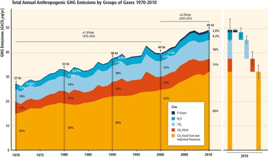
Over the last forty years emissions have just kept growing. The growth rate was greater in the noughties. The growth in emissions is dominated by CO2 from fossil fuels. In 2010 total greenhouse gas emissions were estimated to be 49 Gt CO2eq.
2) The Whole Economy Contributes
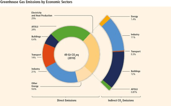
The leading economic sectors for emissions are ‘electricity and heat’ (25%), ‘agriculture, forestry and other land use’ (24%), industry (21%), transport (14%), other energy (10%) and buildings (6%).
3) Economic and Population Growth Drive Emissions
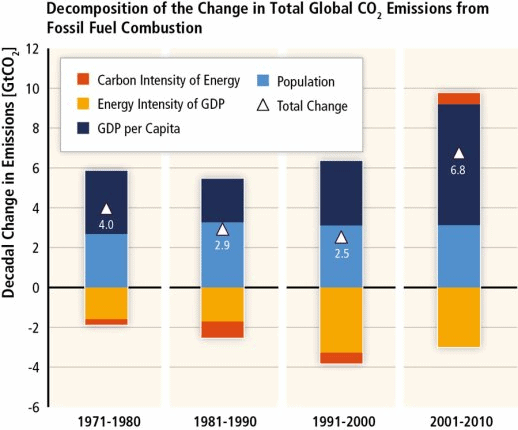
Economic growth and population growth are the key drivers of growing emissions. Improvements in the energy intensity of GDP slows emissions growth. After three decades of small improvements the carbon intensity of energy supply increased in the period 2001-2010. The energy intensity of GDP has consistently decreased for the US in fact.
4) Low Carbon Energy is the Key to Mitigation
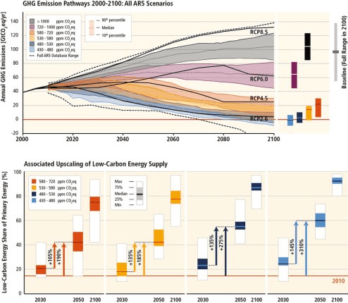
To limit warming by the end of the century to 2°C we need to cut emissions along the blue 450 ppm path. In this pathway a 310% increase in low carbon renewable energy by 2050 helps to make avoiding 2°C by 2100 ‘likely’ (66-100%), and a concomitant reduction in non-renewable energy.
5) Delaying Till 2030 Makes Mitigation Harder
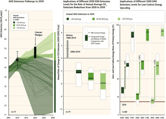
If we delay significant action on climate mitigation the challenge becomes even worse. Delaying the low carbon energy ramp up till just 2030 would require more than doubling its growth in the 2030-2050 period.
6) Mitigation Could Be Relatively Cheap
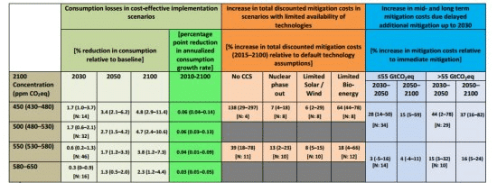
Cost effective mitigation has the potential to be relatively cheap. Assuming global mitigation began immediately, a single global carbon price and good access to technology, the 450 ppm scenario could cost as little as 0.06% per annum (or 4.8% of GDP by 2100). These estimates also omit the value of many mitigation benefits.
7) Cleaner Air is among Co-Benefits
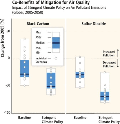
Many actions to mitigate climate change result in co-benefits. Clean air is the most obvious one, but energy security, ecosystem resilience and resource availability may also be improved.
8) Electricity is Key, CCS Will Help
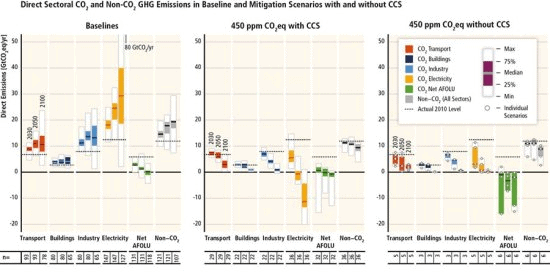
Although mitigation needs to occur in all sectors low carbon electricity is a central challenge. In the baseline scenario above it is the major source of emissions growth whereas in the 450 ppm scenario (without CCS) it drops rapidly. Achieving the 450 ppm target by 2100, without carbon capture and storage (CCS), will require a huge contribution from natural land sinks (forests and soils).
9) Reducing Energy Demand Also Matters
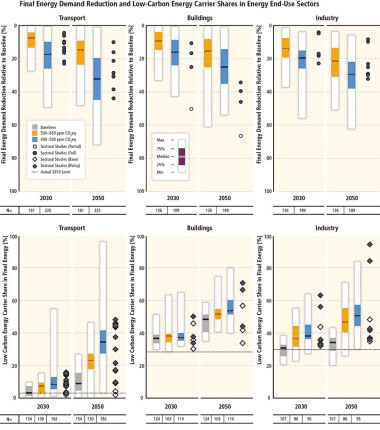
Although ramping up low carbon energy is the central challenge, slowing the growth of energy demand is also a central part of mitigation. Potential for reducing energy demand exists in the transport, buildings and industry end-use sectors.
10) Global Investment is Required
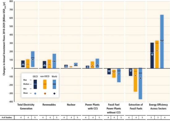
In the coming two decades investment for energy efficiency and renewables needs to surge to start us on the 450 ppm pathway. Nuclear and CCS investment would also help. Fossil fuel investment needs to crash.
That’s the end of our roundup of the ten key charts in the summary for policymakers. But sometimes the charts that don’t make the final summary can be even more educational. These next two charts from the final report explain just why it is so hard to negotiate a global agreement to cut emissions.
10+1) Emissions Growth is in Mid Income Countries
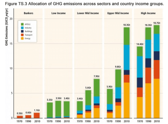
Most emissions growth in recent decades has occurred in Upper Mid Income countries, most notably in the energy and industry sectors in China. In contrast low income countries continue to have limited emissions which are dominated by deforestation emissions.
10+2) Rich Countries Export Emissions
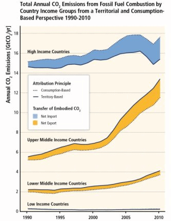
Despite the fast growing emissions of upper middle income countries they still emit less per capita than High Income Countries. Moreover, wealthy countries have outsourced significant carbon intensive manufacturing to middle income countries.
Keen for more? Then go and read the real thing at UNEP.
Lindsay Wilson
I founded Shrink That Footprint in November 2012, after a long period of research. For many years I have calculated, studied and worked with carbon footprints, and Shrink That Footprint is that interest come to life.
I have an Economics degree from UCL, have previously worked as an energy efficiency analyst at BNEF and continue to work as a strategy consultant at Maneas. I have consulted to numerous clients in energy and finance, as well as the World Economic Forum.
When I’m not crunching carbon footprints you’ll often find me helping my two year old son tend to the tomatoes, salad and peppers growing in our upcycled greenhouse.